Posts

Oh Comely - Audience

  Oh Comely website page on advertising and audience 1) Oh Comely introduces itself as a stylish and elegant magazine . This way it comes across as niche and has many loyal readers . Oh Comely claim that they provide unique, yet inspiring, content . 2) T he print circulation/readership statistics for Oh Comely is: Social Media Reach: 100,000  Readers Per Issue: 25,000  Average Age of reader: 27  Sold through independents, WHSmith and international outlets  When comparing with Men's Health it is evident that they have a much smaller circulation/readership , however, this is purely based on the fact that it is a niche magazine , therefore a smaller/loyal target audience , whereas MH is a mainstream audience with a much larger target audience. 3) Oh Comely is distributed to the audience by signing up to annual copies and then get them delivered. They could also buy them from small shops and places ...
Men's Health - Industries case study blog tasks

Hearst publishing 1) Hearst Communications , often referred to simply as Hearst, is an American mass media and business information conglomerate based in New York City, New York. 2) Media industries and brands that make up the Hearst Communications conglomerate are-a wide variety of newspapers, magazines, television channels, and television stations, including the San Francisco Chronicle, the Houston Chronicle, Cosmopolitan, Esquire, 50% of broadcasting firm A&E Networks , and 20% of the sports broadcaster ESPN—the last two both co-owned with The Walt Disney Company. Also, " Hearst UK publishes 21 brands including ELLE, Harper’s Bazaar, Cosmopolitan and Good Housekeeping" 3) The global revenue for Hearst Communications (in dollars) for the most recent year on record is US$ 10.8 billion (2016). 4)" Hearst UK publishes 21 brands including ELLE, Harper’s Bazaar, Cosmopolitan and Good Housekeeping. Our brands reach over one in three UK women and one in four UK m...

Men's Health: Language and Representation

Language 1)  The colours are blue and black, these are stereotypical colours for men. This suggests that the magazine promotes a hypermasculine and traditional portrayal; of men. E.g. Bold, dominant and strong, reinforces gender roles. They follow aesthetic conventions (3 main colours), visual impact and clear communication. The cover lines are in capitals and in bold font and the lettering is tall.- more noticeable. The exclamation mark connotes power. Th e masthead is serif.  The longshot of the actor Vin Diesel, known for his physique and roles in action films, enables audiences to recognise he is a well established. His posture is very masculine, bold muscles stand out.  Verbs such as 'slay', 'blast' and 'wage' suggests battle, hypermasculine idea.  2)  Front cover- The model's head is covering the masthead which implies that MH is a well established brand-standard technique. Vin Diesel seen as an 'opinion leader', direct...

Men's Health - Audience blog tasks

Men's Health Media Pack 1) The magazine introduces itself by giving some background information on what Men's Health is, and what it contains. How they can change and improve a person's lifestyle. 2) The introduction suggests that the representation of masculinity in Men's Health is hegemonic. This is because they have used an exaggerated version of masculinity by showing a man with large muscles, it also focuses on more stereotypical elements of masculinity. 3) The print statistics of Men's Health compared to GQ and Esquire is much more higher. This indicates that because Men's Health has a larger target audience , it has a larger readership, sales and circulation. 4) The difference between circulation and readership is that: Circulation : the actual number of copies printed and distributed. Readership : an estimate of how many people read the magazine in total (also known as readers-per-copy). 5) The circulation of Men's Health i...

Magazine practical task evaluation

Image
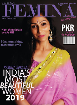
1) 2) I think I have fully succeeded in completing my magazine. However, i originally picked a different magazine to make, but didn't do that one as I cam across this and thought it was better suited to me. 3) I think that my work looks fairly professional along side these magazine covers. The style and colour-scheme matches, the look of the models and central image, barcode etc. 4) I believe that the strongest aspect of my work is the central image, it looks very professional and uses direct address which is what they all use. 5) The weakest aspect was probably thinking of cover lines to match the central image, you have to use something unique,and i wanted to create my own feel to the magazine, so fashion and beauty is the theme of my magazine.  6) I would plan differently, so make sure to look at all the options first as i originally picked another magazine and planned and researched on it which wasted my time. 

Magazine practical task planning

Image
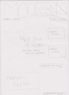
1) Main flash- 'Spring Foward'-'celebrating spring with fresh techniques and stunning looks' 2) The image I will need to catch is a mid-shot, so you are able to see the clothing to a certain extent, but the hair is the main focus. And in terms of the models action, they will either be looking into the camera (direct address) or looking sideways, this is because I have seen that Modern Salon magazines have these two postures. I will be using high-key lighting. 3) The cover lines I will have are: 'Top ten hairstyles' 'braid parade' 'lush lengths'-'creative ways to use hair extensions' 'Sweeping beauty'- 'soft braids, waves and side-swept updos' Underneath masthead will be the issue date: 'April 2018.' On one of the corners it will say: 'ModernSalon.com' 4) This is my sketch (draft):